
Visual Identity Case Studies
If you would like to see my other case studies based on my services, click on the service you’d like to learn more.
Lettering, book cover design, visual identity, speaking engagements, workshops, events and live lettering and marvellous murals.

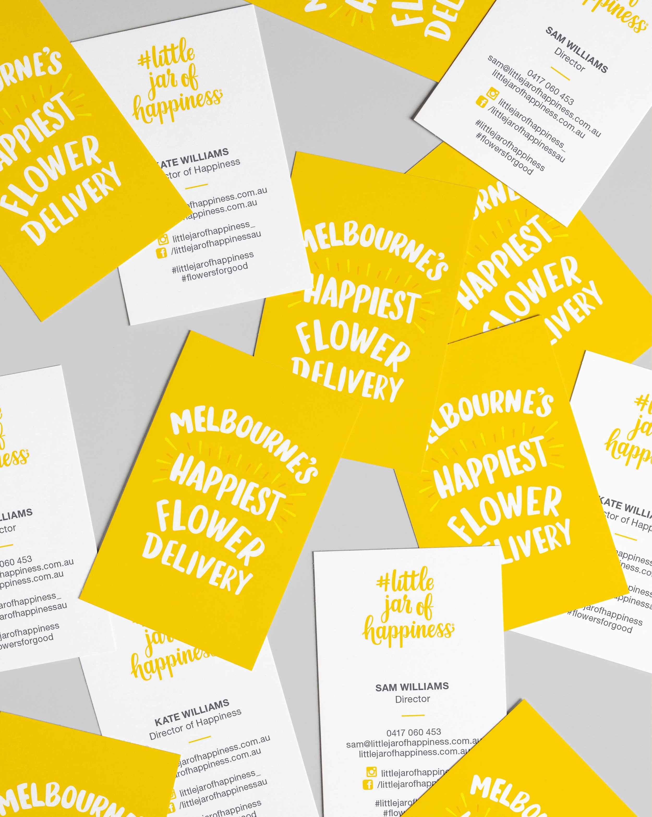
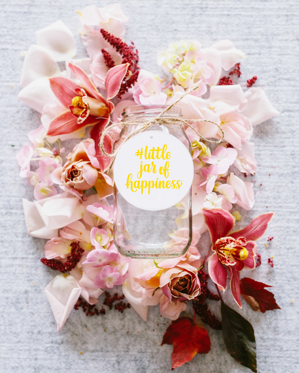
Cheery branding becomes Melbourne’s happiest flower delivery

“Lyn knows just how to create something unique and full of personality, and how to translate that personality into a distinct and memorable brand identity. We are so thrilled we had her to help us bring our brand vision to life. Love your work, Lyn!”
Kate McLean
Director, Little jar of happiness


Client
Little jar of happiness
Service
Brand identity, lettering, illustration, pre-press management, stationery design and graphic design
Background
Little jar of happiness is the happiest flower delivery in Melbourne. They specialise in creating statement blooms and naturally styled flowers for every occasion.
Brief
To craft a visual identity that authentically captured the essence of Little Jar of Happiness. With Kate's vibrant personality and love for flowers at the heart of the brand, the goal was to create an identity that resonated deeply with flower enthusiasts, reflecting Kate's passion and spirit.
The secret sauce
Kate's infectious joy and hands-on approach to crafting loose, natural statement blooms inspired the branding. To represent Kate's essence, I designed a distinct hand-lettered logo using a brush and ink, capturing the joy of working with her hands. Each stroke formed unique and organic shapes, embodying her warmth, authenticity, and happiness.
The result
An unforgettable brand identity that flower lovers and customers associate happiness with. A brand that has now become Melbourne’s happiest flower delivery service.
Credit
Lettering and branding by Lyn Tran, letterpress by Saint Gertrude, foil printing by Mickey loves Jacqui and photography by Sophie Timothy and Steph Wallis.

Transforming choice: The impact of minimalist design on sustainable pet nutrition selection
Client
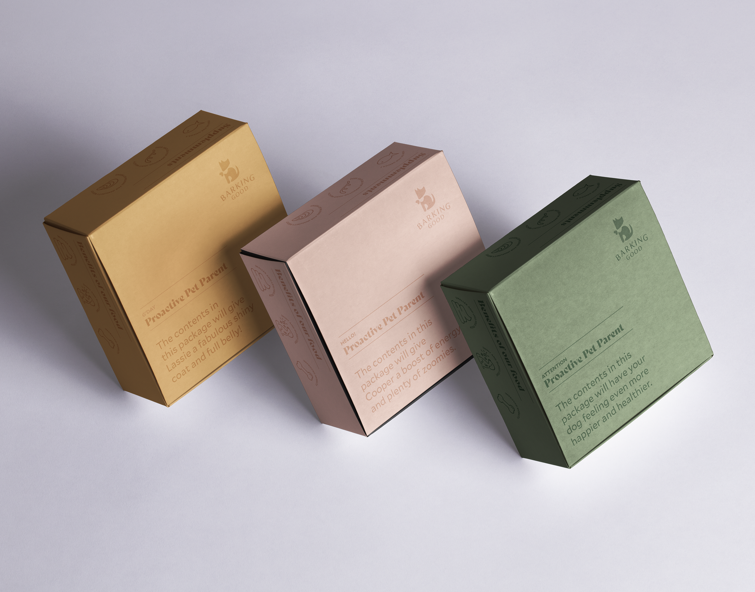
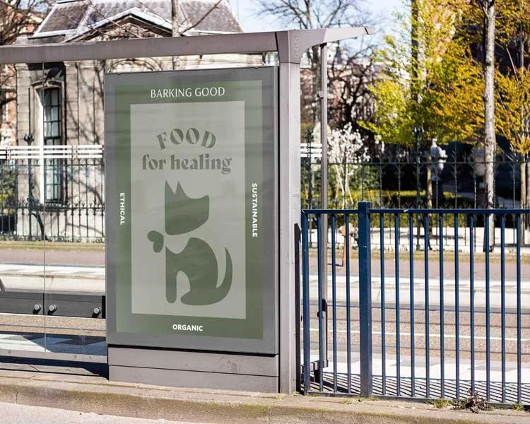
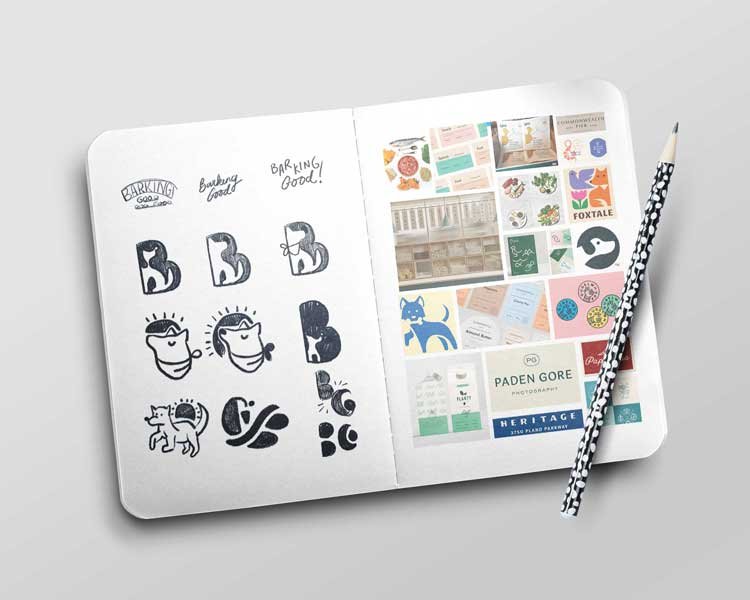
Barking Good
Service
Logo design, custom illustration, packaging design, label design, out-of-home (OOH) design, graphic design, customer research, point of sale research, pre-press management
Background
Barking Good is dedicated to offering sustainable and ethical meals and supplements for pets. In response to concerns about the negative impact of commercial pet food on animal health, Barking Good wanted to establish authority and credibility in the market by emphasising their commitment to natural, trustworthy, and pure products.


Brief
To create a visual identity that reflected Barking Good's brand traits and differentiated them in the market. Then rolling out the branding collateral.
The secret sauce
To stand out in the market, I focused on minimalist design principles that conveyed the purity and quality of Barking Good's products. Through soft hues reminiscent of nature and superfoods, each colour was chosen to represent essential food groups for a balanced and healthy diet. The logo incorporated a heart symbolising Barking Good's dedication to customer care and generosity. By adopting a clean and simple aesthetic with eye-catching typography, the design aimed to set Barking Good apart from competitors' cluttered packaging.
The result
The minimalist design approach resonated positively with pet parents, conveying Barking Good's commitment to transparency and quality. The visual identity helped Barking Good establish itself as a trusted provider of premium pet products, appealing to proactive pet owners who prioritise their pets' health and well-being. By aligning the brand's image with the values of care, quality, and environmental sustainability, Barking Good successfully differentiated itself in a competitive market.
Credit
Design and illustration by Lyn Tran

Pooch Pals delivers pooch-perfect engagement and sales
Client
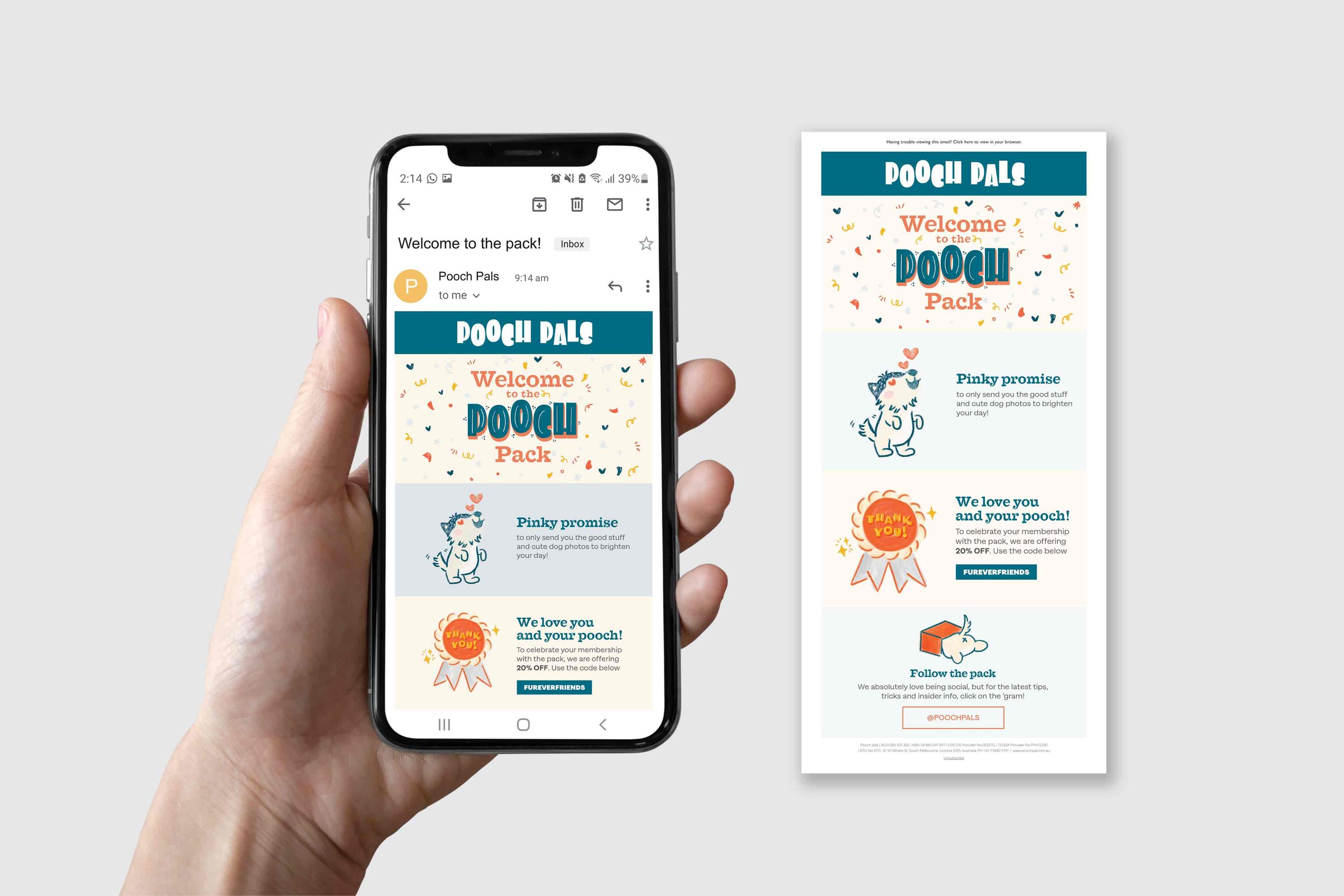
Pooch Pals
Service
Custom logotype, brand identity, illustration, lettering, packaging, and graphic design
Background
Pooch Pals, a new player in the pet industry, aims to make a lasting impression on the dog community by offering thoughtfully designed dog wellness products and treatments. Their mission is to enrich every pooch's life with products that reflect their love of dogs and commitment to quality.


Brief
I was tasked with designing a brand identity system that would capture Pooch Pals' essence of being down-to-Earth, playful, and accessible.
The secret sauce
To differentiate Pooch Pals from their competitors, I conducted extensive research on the pet market. Drawing insights from this research, I strategically selected colours uncommon in the industry and employed illustration styles that deviated from standard vectors. By incorporating tactile illustration techniques and a customised logotype, I ensured that Pooch Pals' visual identity was both distinctive and attention-grabbing in the competitive pet industry.
The result
With the implementation of a vibrant colour palette, tactile textures, illustrations, and hand lettering, Pooch Pals' visual identity distinguished itself in the market. The brand's playful and accessible personality resonated with dog parents, helping Pooch Pals establish itself as a trusted name in the dog wellness industry.
Credit
Lettering and design by Lyn Tran
Some of our fab and fun clients
If you would like to chat to me about your branding and visual communication needs click here.

Brand Identity Case Studies
If you would like see my other case studies based on my services, click on the service you’d like to learn more.
Lettering for editorial and advertising, brand identity, workshops, events and lettering and marvellous murals.
